I know, I know. UX researchers are supposed to be in love with their post-it notes and affinity diagrams. Forgive me, but when it comes to note-taking and distilling findings from user research and usability testing, I think we might have gone a bit overboard. Affinity diagramming is one of the most popular methods for organizing ideas and qualitative data, but if misused, it can easily become a fatiguing exercise, which loses its merit. In this session you will learn some of the pitfalls to avoid when using affinity diagramming for user research and explore some alternative methods that have proven to be successful for collaborative analysis.
Talk Gallery
-
IAS17
More Talks by Kyle

VideoSlides
Using AI to Streamline Persona and Journey Map Creation
TopicsDesign Strategy, Design Thinking, Product Development, Robotics & AI
Kyle Soucy dives into practical methods and tools that streamline Persona and Journey Maps...

VideoGeneral Info
UX Research Tutorial: Using the Collaging Method for Sensitive Topics
TopicsDesign Thinking, Methodology
In this tutorial, Kyle Soucy demos how to use the collaging method for UX research....

SlidesGallery
Whoa! Did You See That? Collaborative Data Collection and Analysis
TopicsDesign Strategy
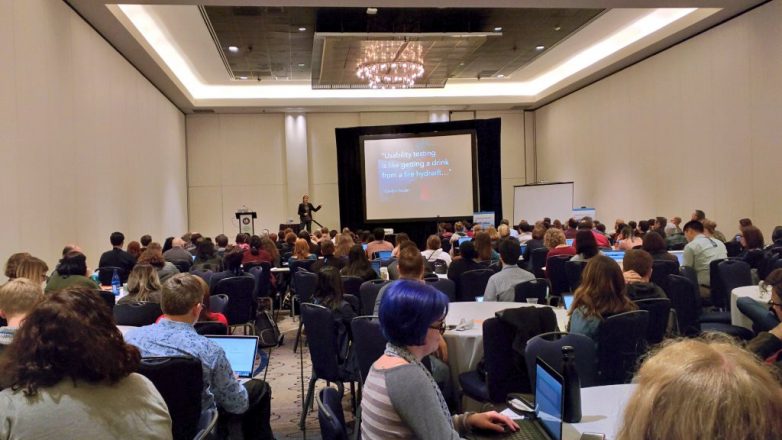
Observing a usability test is like witnessing an accident; everyone sees it go down...

VideoSlidesGallery
Gather Round: How to Share the Stories from UX Research
TopicsDesign Thinking, Storytelling
As UX Researchers, our job is not over when the interviews are finished. In fact,...

VideoSlides
Collaging: Getting Answers to the Questions You Don’t Know to Ask
TopicsDesign Thinking
Talk at ConveyUX about using Collaging, a needs-elicitation technique, in UX Research....
VideoSlides
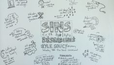
Sins of a UX Researcher
TopicsCareer, Storytelling
Let’s face it; while moderating a usability test or research study even the most...

VideoSlidesGallery
Architecting the Outcome
TopicsCommunication
This talk was given at World IA Day Boston...

VideoGeneral Info
How to Create & Use UX Personas
TopicsMethodology
This course covers how to create and use UX personas. It was created for EBSCO...
Discover More Talks
More talks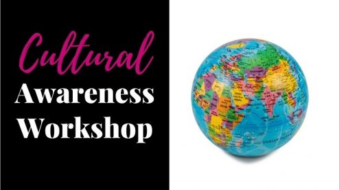
VideoGeneral Info
Amplify Cultural Awareness In The Workplace
DisciplineBusiness
TopicsCareer, Communication, Community, Diversity & Inclusion, Sustainability, Teamwork
Speaker Vivian Acquah
This workshop will provide you with tools to help your team overcome cultural differences....

Slides
Ethics & AI: Designing for Health
DisciplinesUser Experience, User Research
TopicsDesign Thinking, Ethics, Robotics & AI
IndustryHealthcare
Speaker Amy Chenault
What do we, as designers, strategists, thinkers, think of putting vulnerable moments...

VideoGeneral Info
Managers, Create Space to be Awesome
DisciplineEngineering
TopicsLeadership, Robotics & AI, Teamwork
Speaker Meri Williams
Meri Williams, CTO of a healthcare startup, talks about stealing lessons from...
Speakers, Get Featured
Get connected with event organizers interested in engaging women and gender non-binary speakers in design and tech.
Sign UpAlready have an account?
Log inKnow a great speaker? Let us know so we can invite them to be part of our directory and amplify their voice.
Nominate them